Behind the Scenes at the Elizabeth Arden Pretty Advertising Shoot
The concept for Pretty advertising and TV campaign was created by Mark Dixon, Vice President Creative Director, Elizabeth Arden.

Behind the Scenes at the Pretty Advertising Shoot.
What was the inspiration for the Pretty campaign?
“I’ve always enjoyed watching a woman apply her makeup and get ready to go out. It started with my mother and sisters. There’s is a real one-on-one connection between a woman and a mirror. The idea for the TV was to capture that sweet, personal moment between a woman and a mirror when she pleasingly sees that she’s pretty-and how being pretty affects everything around her.”

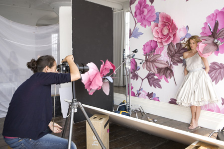
For the print portion of the shoot we wanted to capture an image that defines “pretty” in a single image-from the model and mirror to the wardrobe, furniture, props and of course that amazing wallpaper.”
The print and television advertising was co-directed by husband and wife team, photographer Coliena Rentmeester and film director Tom Dey.
How did you create the look for pretty print and TV advertising?
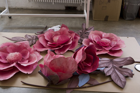
Coliena Rentmeester, Photographer: “We were inspired by the name Pretty. For the visual images we started with the idea of using the wallpaper, enlarging the flowers, adding more flowers in the same palette for an excessive, dramatic, warm environment. We wanted to use the colors of the floral itself, to keep it tonal. And the lightning is essential to create a mood. We want someone to look it and say. “That’s really pretty.'”
Tom Dey, Director: “For the TV commercial, we wanted to create a visual personality and identity for this perfume. It starts with a woman who is getting ready to go out and fragrance is the last touch. We wanted to create a sense of ‘sillage,’ which in French means an image that you take away, like the wake of a boat, that creates a lasting impression-just like the fragrance. The challenge was to achieve this with he elements of our set, the mood created by the lighting, to watch the room transform and the flowers come to life. And the technical challenge of shooting an over the shoulder against a mirror.”
How do you work together?
Coliena Rentmeester, Photographer: “We often work together and working together can be a challenge, but a challenge that results in progress. We bounce ideas off each other, we compliment each other. I bring a softer vision, more fantasy to the set. Tom is more rational. We both love to work with light. We appriciate each other;s aesthetic. I guess you could say it’s a working marriage that works.”

Tom Dey, Director: “Working together on the Pretty campaign, we had a lot of freedom. We were able to explore different ideas, to create something fresh and new. To bring together all the creative people. And of course create continuity between advertising visual and the commercial.”
What was the concept for the set? Maria Santana, Set Designer: “The original concept was simply pretty, feminine and modern. It was fun to build the set by taking the traditional wallpaper and the flowers, then scaling then up and then making it all come to life. We worked with a special effects person who created puppets of the flowers and then animated them.”
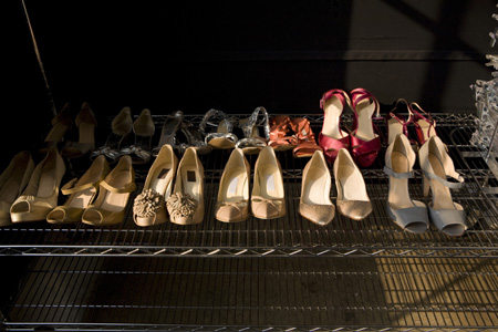
What was the concept for the styling? April Hughes, Stylist: “It all starts with the wallpaper, the colors create the palette. The look is modern but feminine, with a little bit of old Hollywood glamour, a sense of fantasy. It’s an image of a woman with a sense of style and softness, who is not filly. but definitely feminine.”
